01 / Overview
A direct visual system for a growth-focused strategy studio.
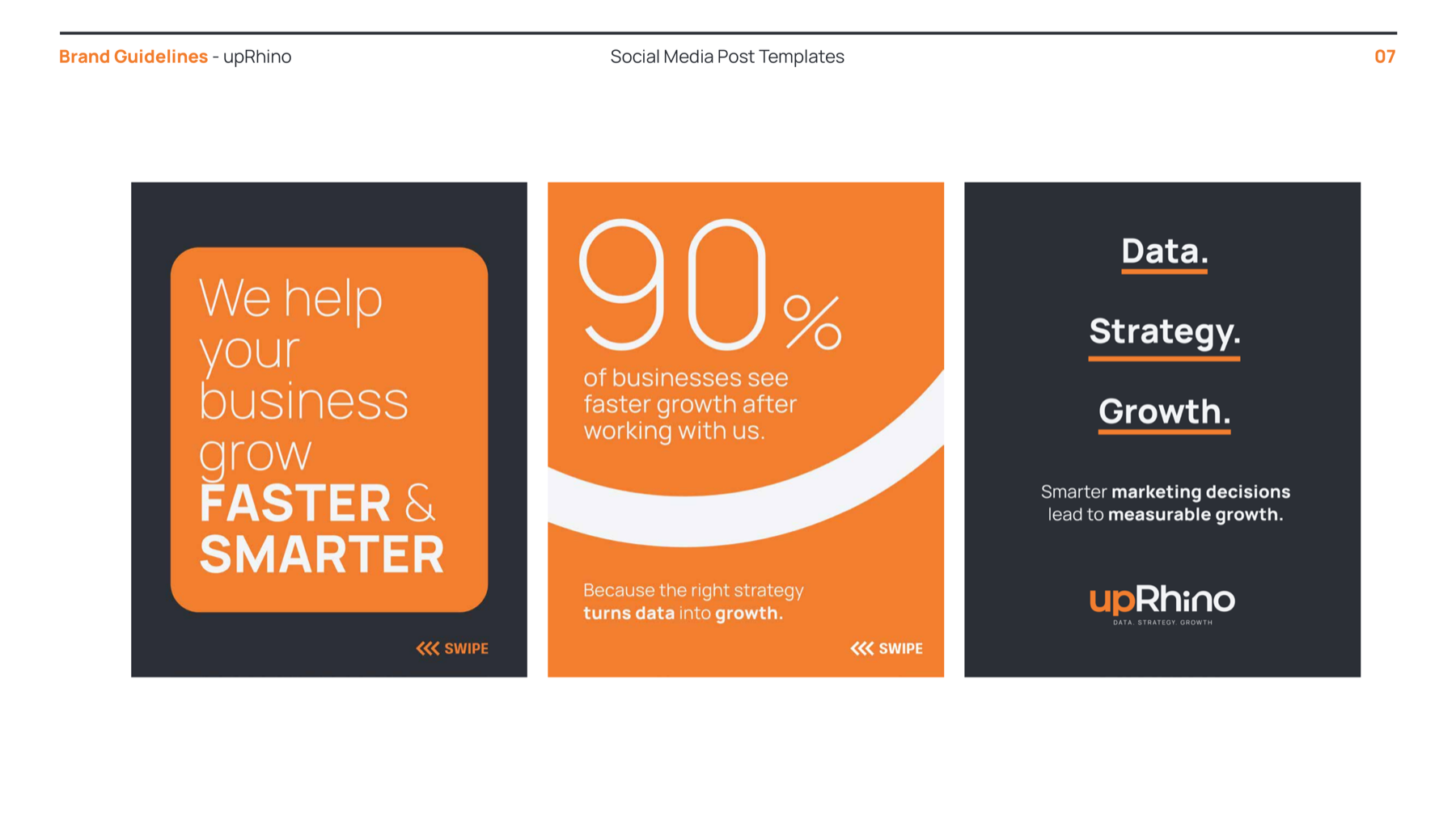
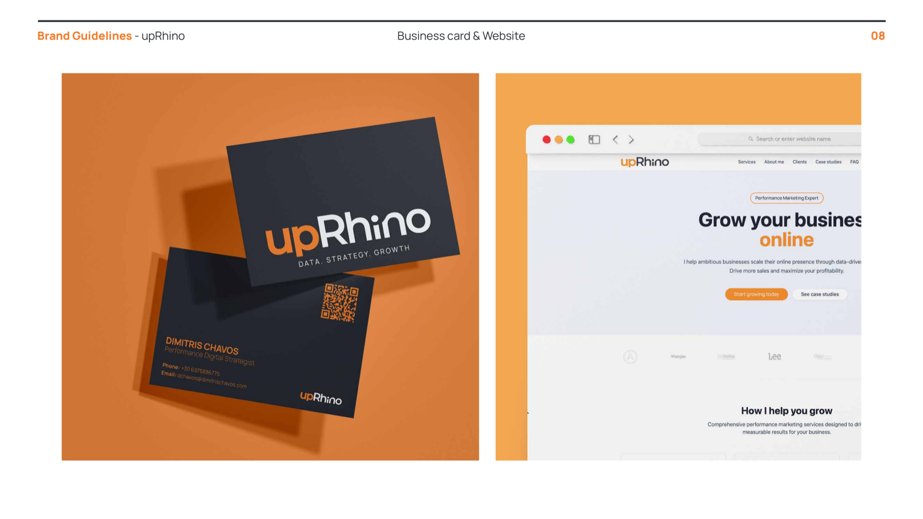
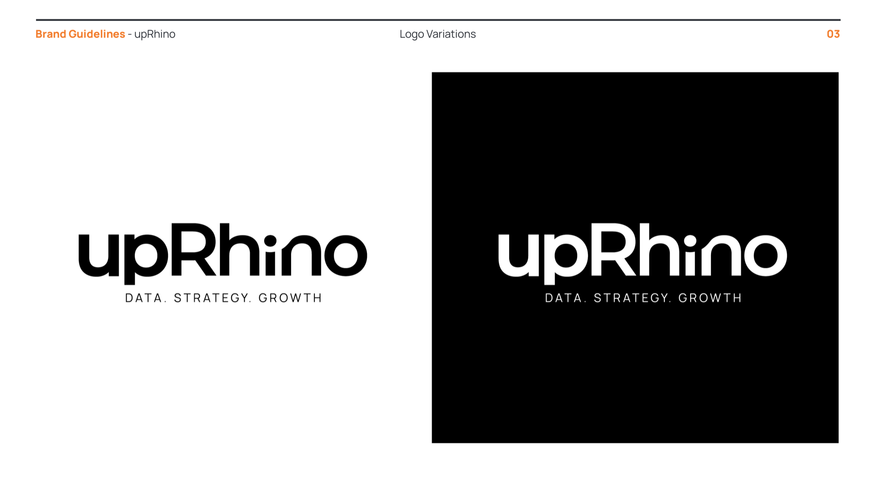
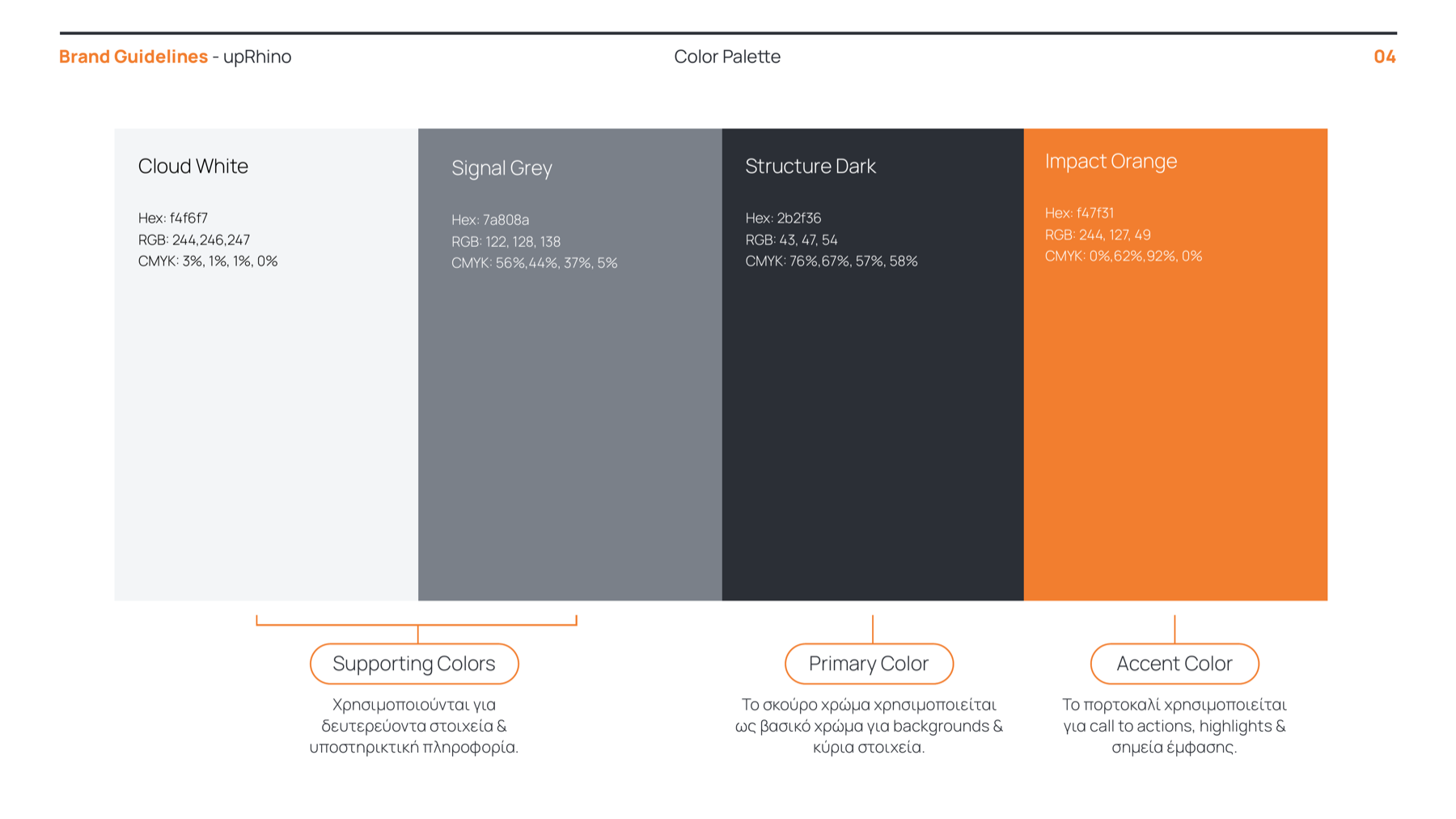
upRhino pairs a confident, structured dark base with a high-impact orange accent. The identity was developed as a flexible system across logo use, colour, typography, digital templates and print applications.
02 / The system
Built to be recognised quickly and used with consistency.
03 / Rules & rhythm
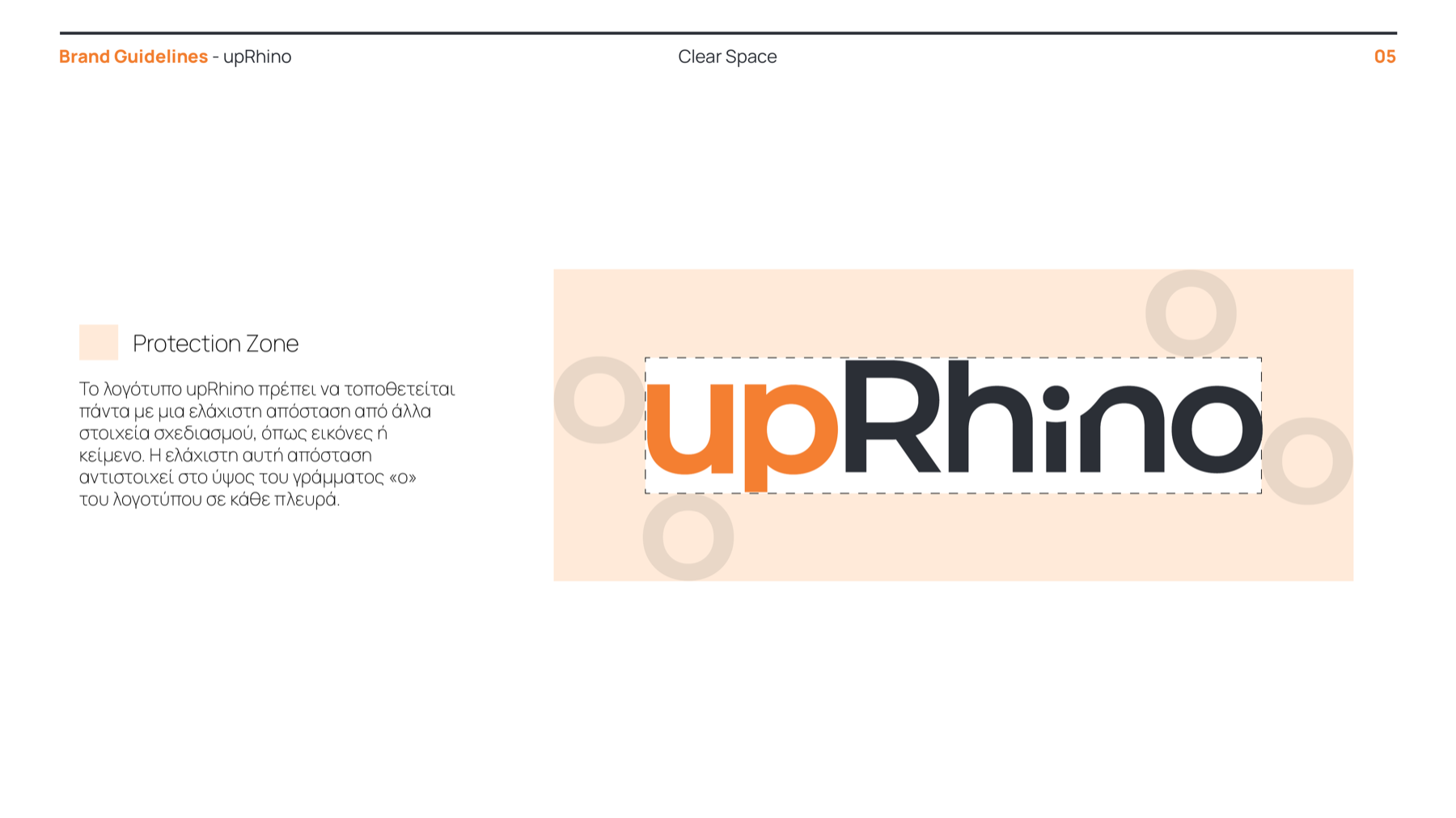
The visual system makes the brand feel precise before a word is read.
04 / Typography
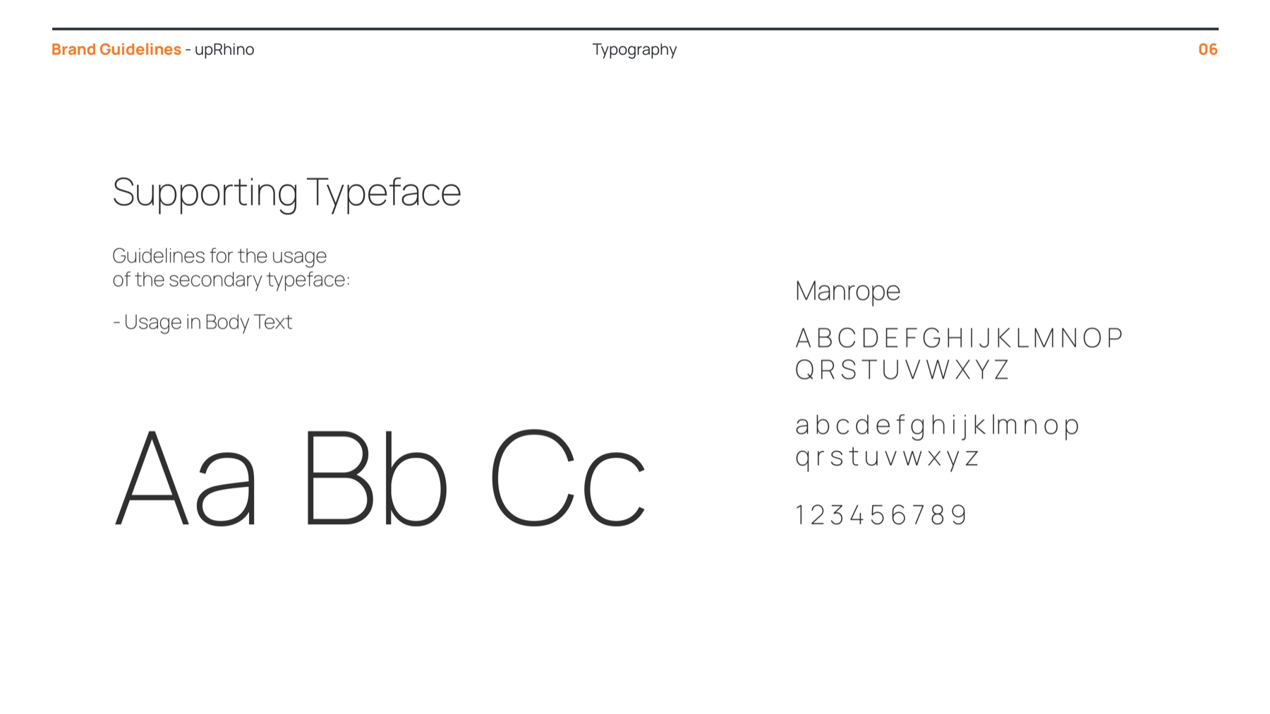
Manrope gives the identity a crisp, contemporary voice.
Used for supporting communication and body copy, its open forms keep information legible across print and screen.
05 / Applications
A toolkit designed to carry the brand into everyday communication.